
The situation
SETTL is a privacy-focused payment chain built on the Carbon Protocol — private, compliant, and extremely fast. It targets tier-1 financial institutions and PSPs in a fast-moving competitive field (Tempo, Arc, Plasma).
I joined the ~12-person core team at Ava Labs as the design lead across product, brand, marketing, and GTM. The product was originally called AlphaPay; partway through, leadership decided to reposition. I built the original brand, then led the migration to SETTL — two full identity systems shipped without losing continuity.
The job was translation and finding the balance
Between a complex blockchain protocol and a multi-faceted user base. Between web3 engineers and financial institutions. Between racing the market and showing up mature enough to be trusted by it.
Translation is a real design discipline. Most product design assumes the categories already exist — user, product, market. When none of them do yet, the design work is defining the categories, not styling them. Two problems sat at the center of that work.
See it live
Problem 1 — Land a brand under pressure
The brand had to read as bank-grade to a Goldman risk team and engineer-respected to a protocol architect — same artifact, two readings.
That tension showed up internally too. Engineers were driving protocol decisions and held strong opinions on technical positioning. Leadership leaned toward a traditional finance narrative. Aligning these required real fluency in both — enough technical understanding to hold ground with engineers, enough business sense to translate for institutional buyers.
By that point, the team had spent months heads-down on protocol and infrastructure. We needed a GTM strategy and brand identity — fast — to convert that technical foundation into something institutional partners could evaluate.
On top of that, we were operating against well-funded competitors with more leverage. Time was the binding constraint. We had to sequence the roadmap into stages that could plausibly win — technology-led first, partner-led next, business-narrative-led after — while managing parallel processes that don’t usually run in parallel. The cleanest expression of that pressure: I was designing the SETTL logo while it was still being trademarked, with no guarantee we’d get full legal approval, and with the domain and social handles also in motion. The work had to be good enough to use immediately and disposable enough to walk away from if it didn’t clear.
What I did
- Designed and facilitated the first structured brand alignment workshop, with pre-workshop research and a survey (deeper write-up below).
- Owned coordination with marketing and an external brand agency (moved away from later). Walked into the engagement with a fully defined direction — they called it the most thorough brief they’d ever received.
- Built voice guidelines, deck templates, GTM one-pager, and sales materials from scratch — standardized so sales and marketing use them live with institutional partners.
- Designed and shipped two brand systems used across business and product (AlphaPay → SETTL), and led the migration without breaking continuity.
How I drove alignment
Brand decisions were getting made in opinion battles. Strong views, no shared vocabulary, no framework for what “good” looked like.
The team had an upcoming offsite scheduled with engineers, which was the right forum: most of the people whose opinions had to align were already going to be in one room, and the agenda already covered GTM and product. I designed a structured workshop into that time so we walked in with positions to compare.
Designing the workshop
Pre-work. I sent a survey covering positioning, audience priorities, and tone-direction questions, plus a competitive analysis of ~14 reference sites grouped by stance (institutional, modern/clean, bold/technical, privacy-forward). Participants completed the survey before the session, so we walked in with everyone’s positions already on paper. That also let me see exactly where the misalignment was, and design the session to focus on the issues that actually mattered instead of the easy ones.
The room. Protocol engineers, the product CEO, marketing, front-end engineers, and a QA engineer — most of the people whose opinions any later brand decision would have to satisfy.
Activities, in order.
- Persona definition and prioritization — produced an agreed primary/secondary audience, which made every later debate resolvable by asking “for which persona?”
- Tagline selection, framed as “if you were to tweet, what would you write?” — narrowed candidates against the persona output.
- Competitive marking exercise — like/dislike voting on real reference sites, giving non-design folks a concrete object to react to instead of an abstract debate.
- Tone-direction scales — sliders on dimensions like conservative ↔ bold and technical ↔ accessible, with real examples placed on the scale, forcing positional commitments instead of vague preferences.
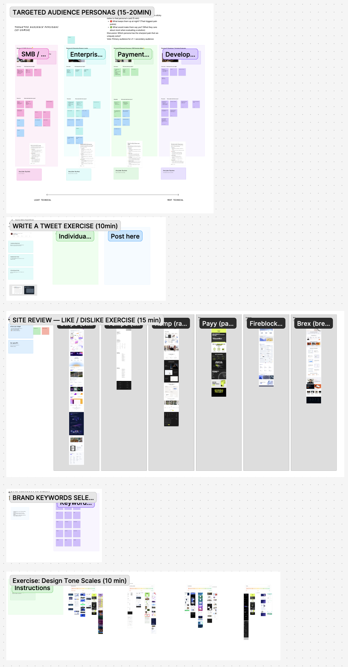
The artifacts that did the heavy lifting. Two outputs kept getting referenced after the room cleared. The persona prioritization board gave us a primary/secondary audience the rest of the work could be tested against — every later “is this on-brand?” debate became resolvable by asking for which persona? The tone-direction scales turned vague preferences (“modern,” “trustworthy”) into committed positions on a small set of axes, so future calls could anchor against where the team had landed instead of restarting from feel.
Driving alignment when people disagreed
On the tone-direction scales, debates kept getting tangled in surface-level distractions — reference examples carried their own visual baggage that wasn’t actually about the dimension we were measuring. The move that worked was pausing the discussion and routing it back through the target audience: which persona is this for, and what would they read first? As the designer in the room, I could usually tell which objections were real signal and which were noise — and where I was confident a direction would land for everyone once the noise was filtered out, I’d say so and we’d move on.
The hardest disagreement was the traditional-enterprise ↔ cutting-edge axis. Engineers wanted something cool and tech — bold, web3-native design. Leadership wanted banking — restrained, enterprise-grade. On the surface, those positions read as mutually exclusive. Underneath, there was a shared consensus: this wasn’t web3 infrastructure looking for a use case, it was infrastructure with a real business application. So I committed to a 70-30 split — 70% earning trust through transparency and restraint, 30% naming the groundbreaking technology underneath. Both sides could read what they cared about in the result.
What landed wasn’t just a visual direction. The workshop named what actually set the product apart: solving the impossible triangle of speed, compliance, and privacy.
What came out
- A clear primary/secondary audience, with priorities. Tier-1 enterprises were the audience to design for first.
- A complete brand kit — visual system, messaging, tone — with documented standards engineers and sales could apply themselves.
- The internal vocabulary the team now uses in product, engineering, and sales conversations.
- The workshop becoming the precedent for how brand questions get answered at the company.
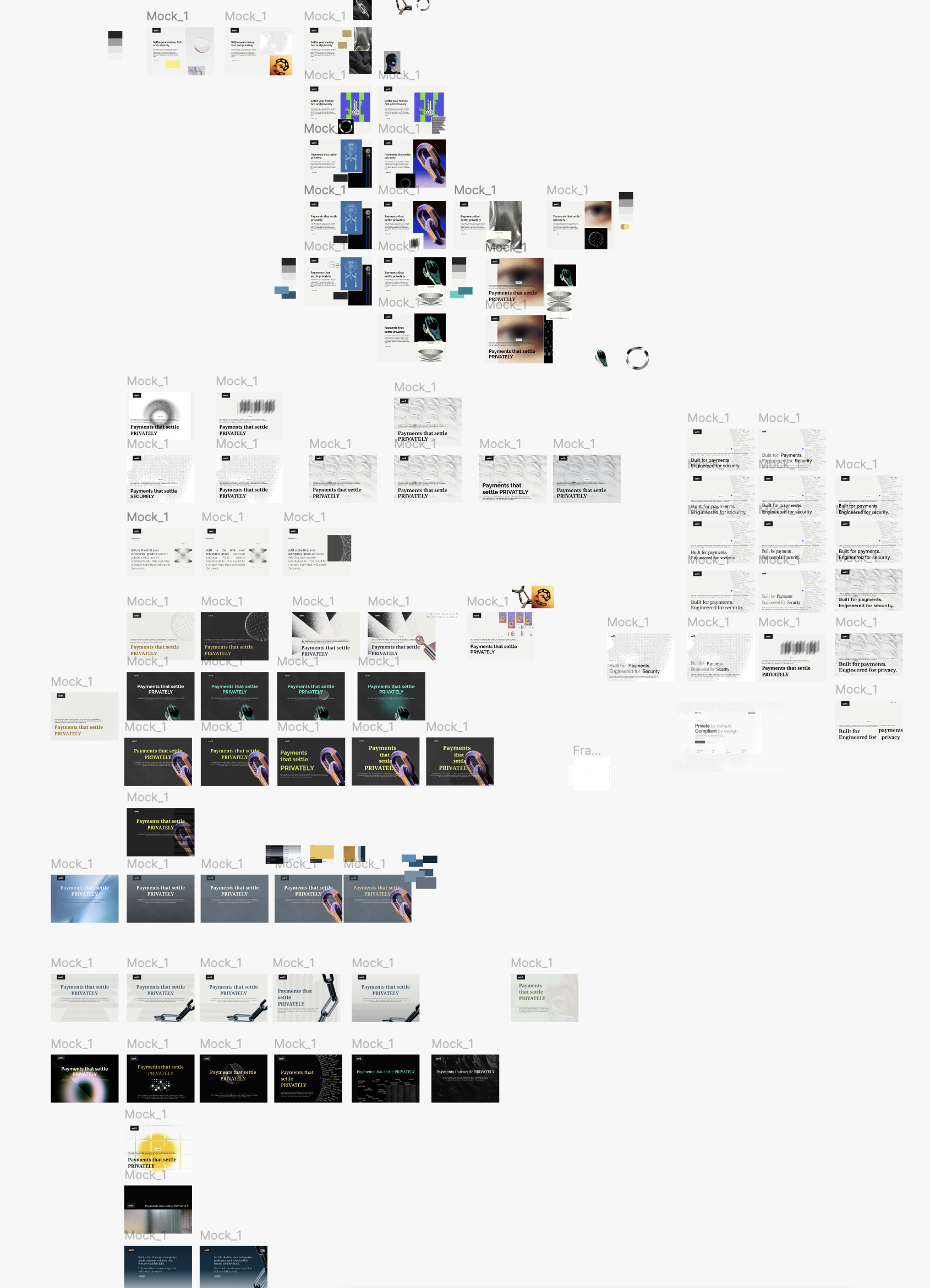
- A round of post-workshop visual exploration that confirmed the direction — and named what to avoid in graphics, typography, and imagery — before any of it shipped.
Problem 2 — Make privacy legible as trust
Encrypted balances. Ring-protected recipients. Selectively revealable transactions. Auditor keys. These are innovative protocol features. None of them have an established UX pattern. Tier-1 buyers don’t know what any of those words mean.
I worked the problem across four surfaces, each translating a different layer of the protocol.
The four surfaces
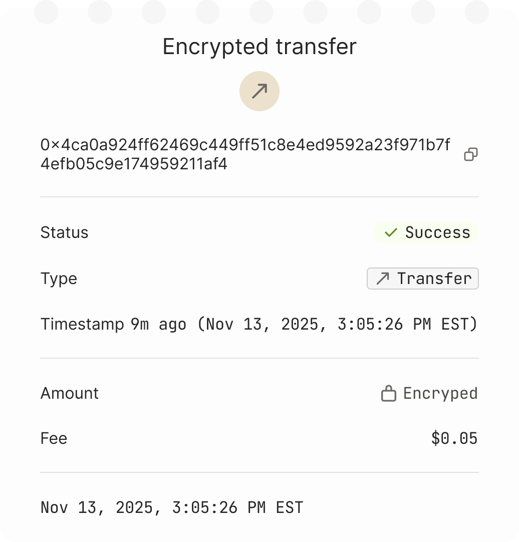
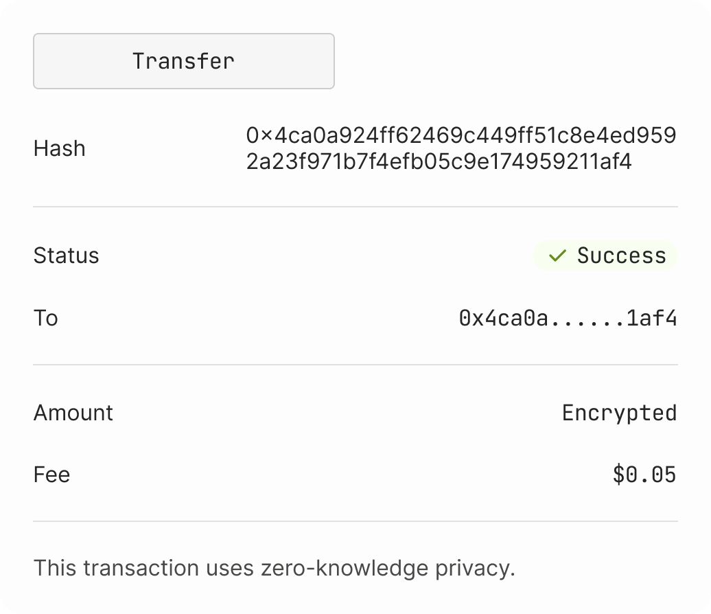
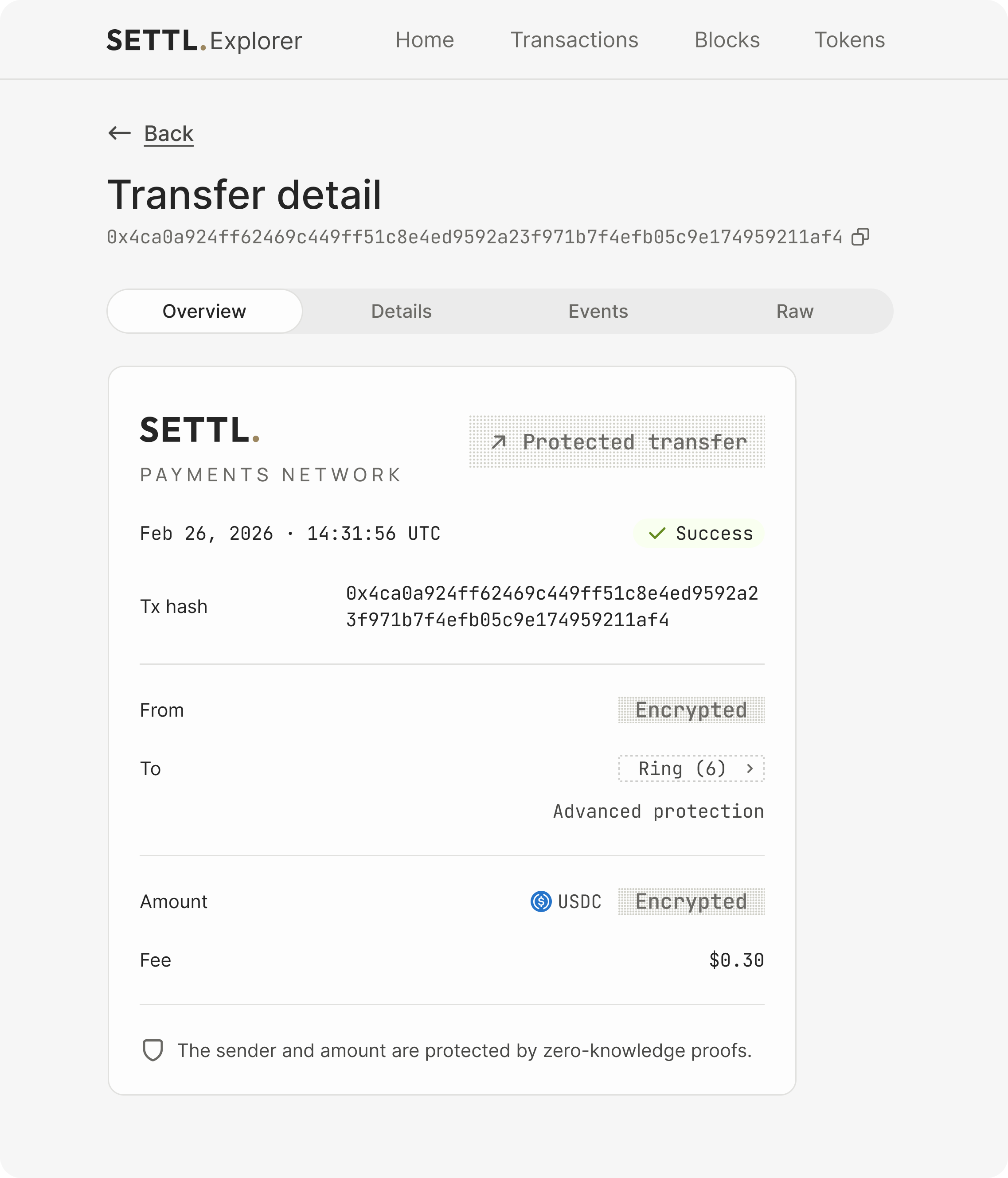
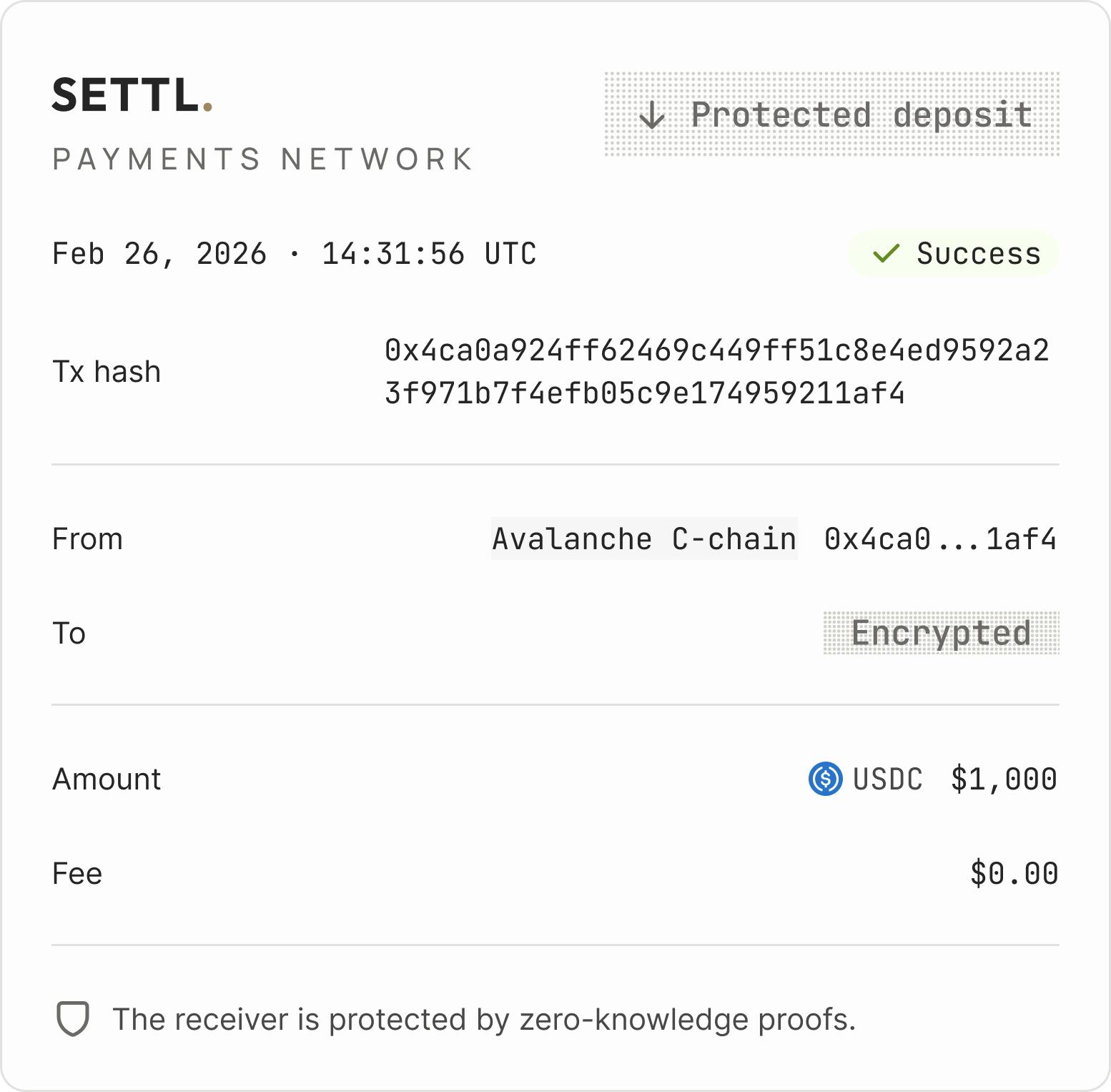
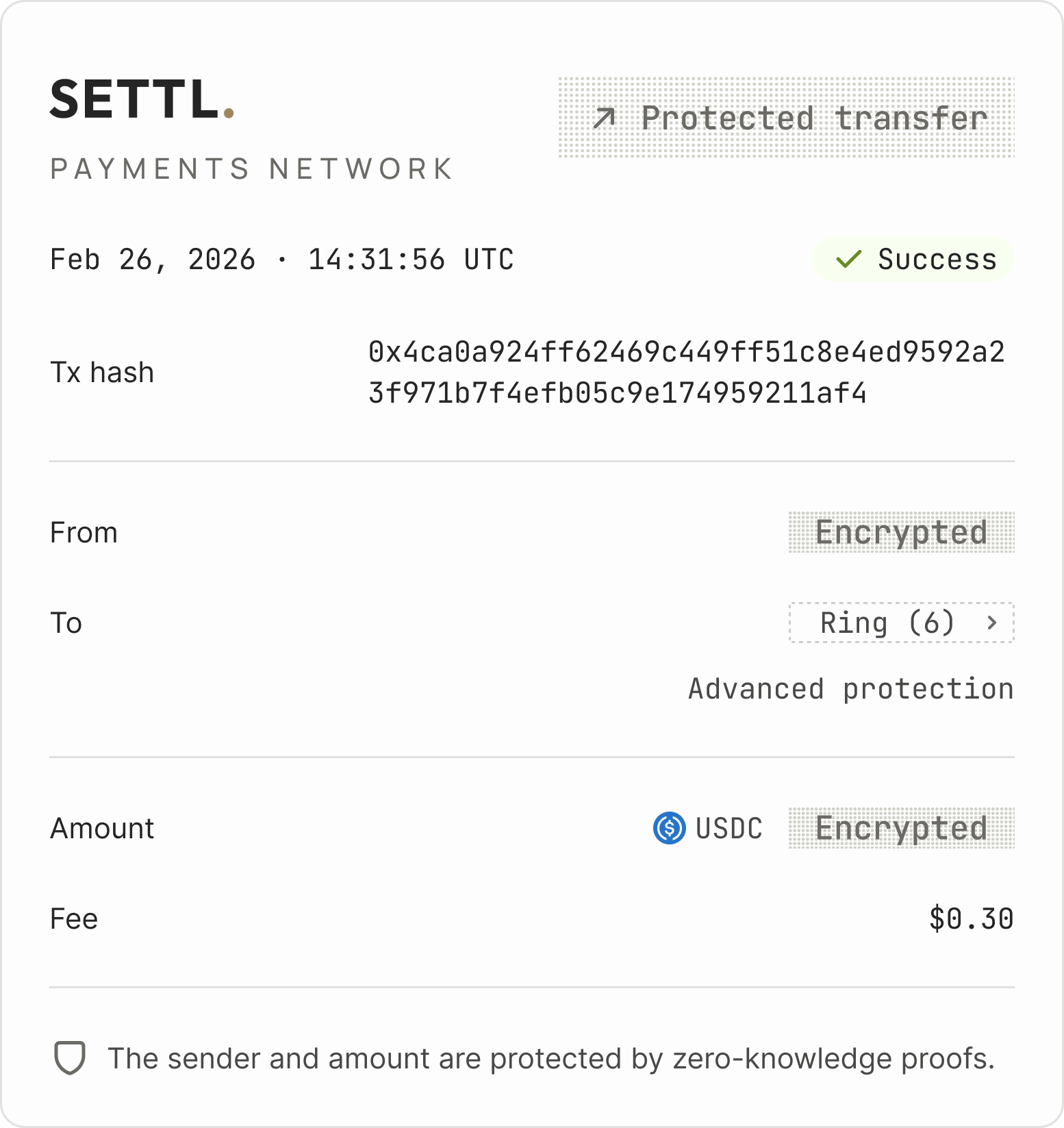
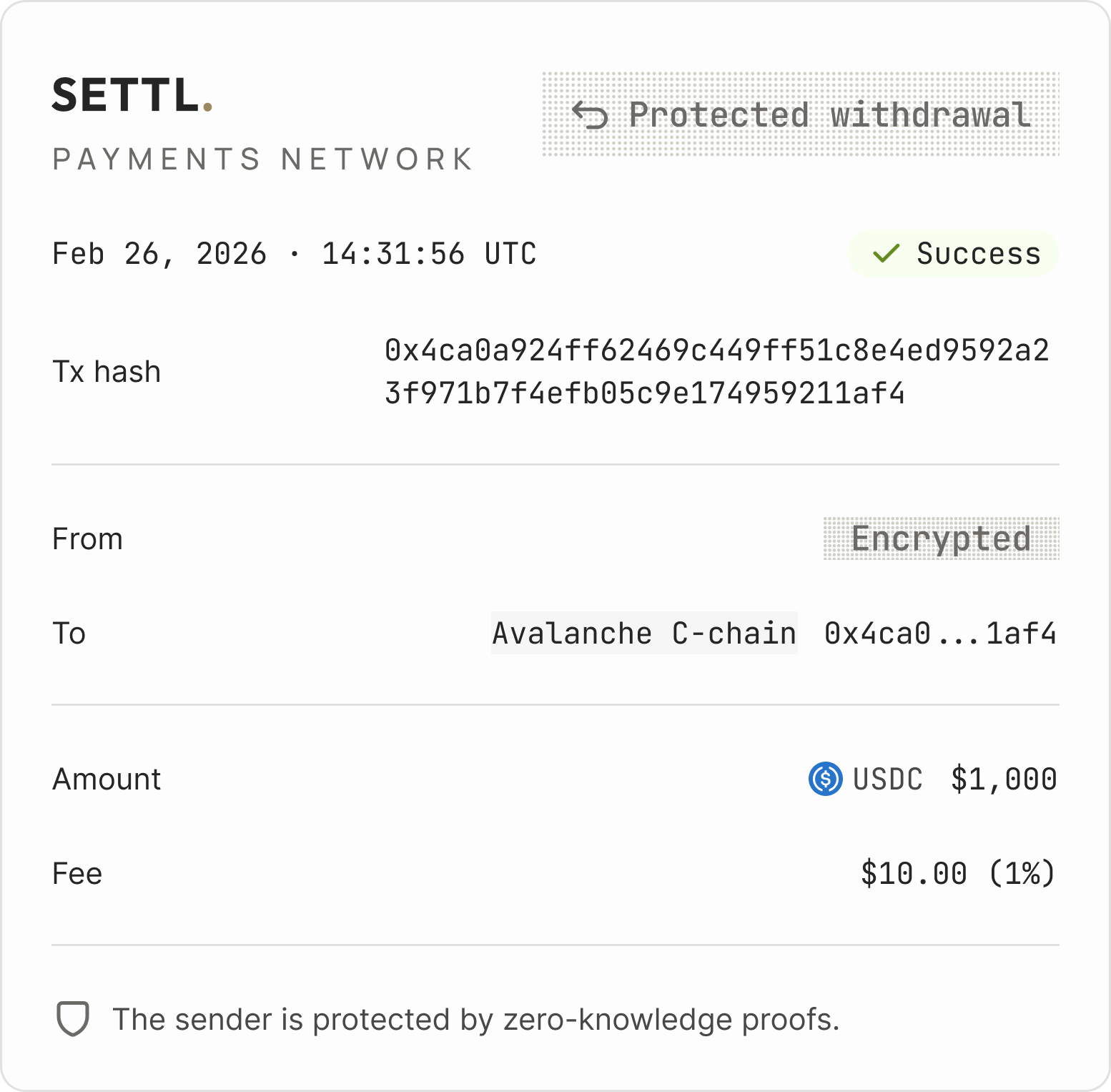
- The Explorer — the public receipt that proves the system works. Encrypted fields had to read as deliberate and valuable, not missing or broken.
- The Wallet — making advanced cryptography feel like normal money. Deposit, withdraw, and transfer flows; Advanced Recipient Protection; an additive fee model where every cost is visible.
- The Policy module — multi-role compliance UX with auditor key flows for use cases that didn’t exist yet. Function-heavy.
- The Marketing site — translating Carbon Protocol into business-language value props the sales team uses live with institutional partners.
A favorite design decision: encrypted ≠ missing
When we reviewed the early Explorer designs, engineers pushed back: don’t show the encrypted data — no one can read it anyway, so why surface it? My counter was two-part. From the user side: a transaction with no amount field at all looks broken, not private. The user wonders if something’s missing. From the business side: native encryption is the differentiator. Our protocol’s privacy architecture was, I believed, the strongest in the field — no one else had achieved it at this layer. Hiding it in the Explorer would be hiding the thing that makes the product remarkable.
So the question shifted: how do we show encryption in a way that signals confidentiality, not absence?
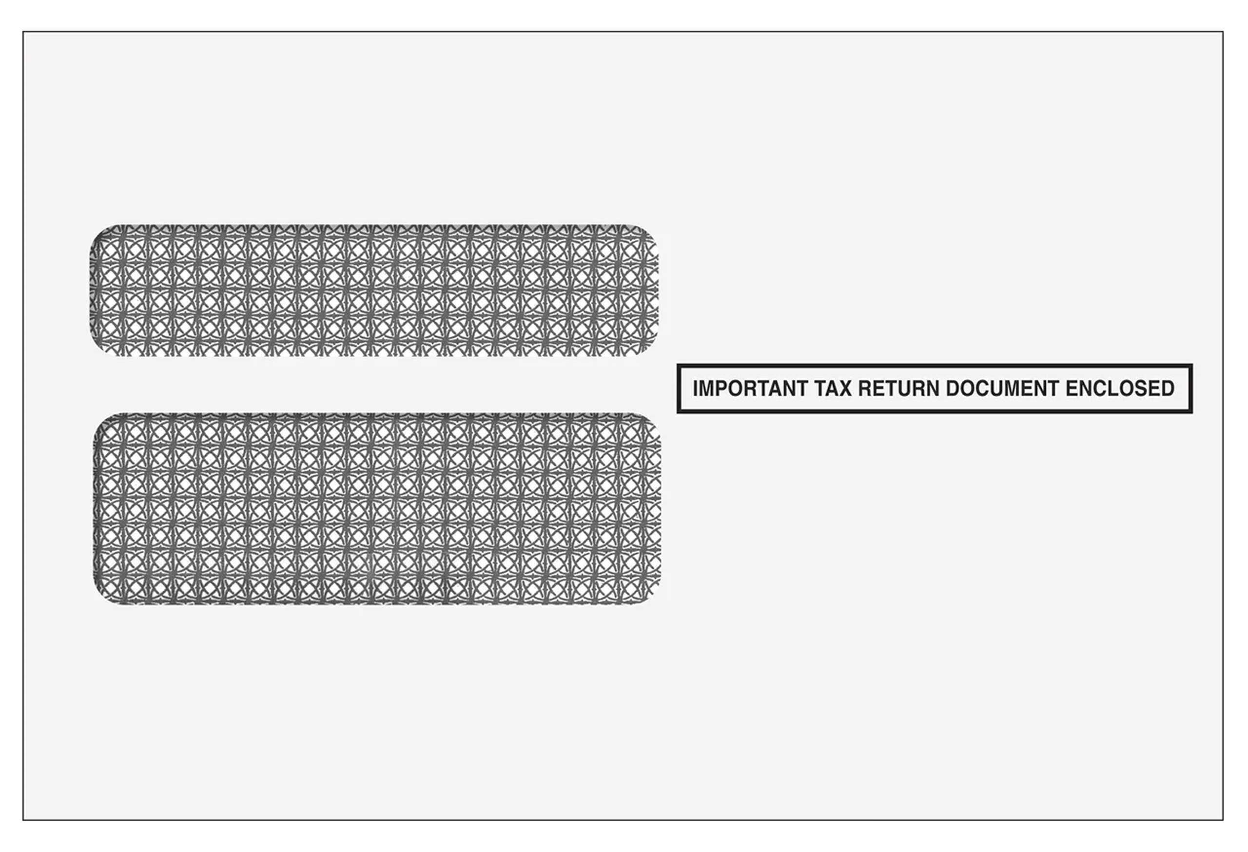
Early explorations leaned redundant or paranoid — heavy redaction marks, dense overlays. They read as suspicious, not safe. The breakthrough came from looking outside the screen entirely.
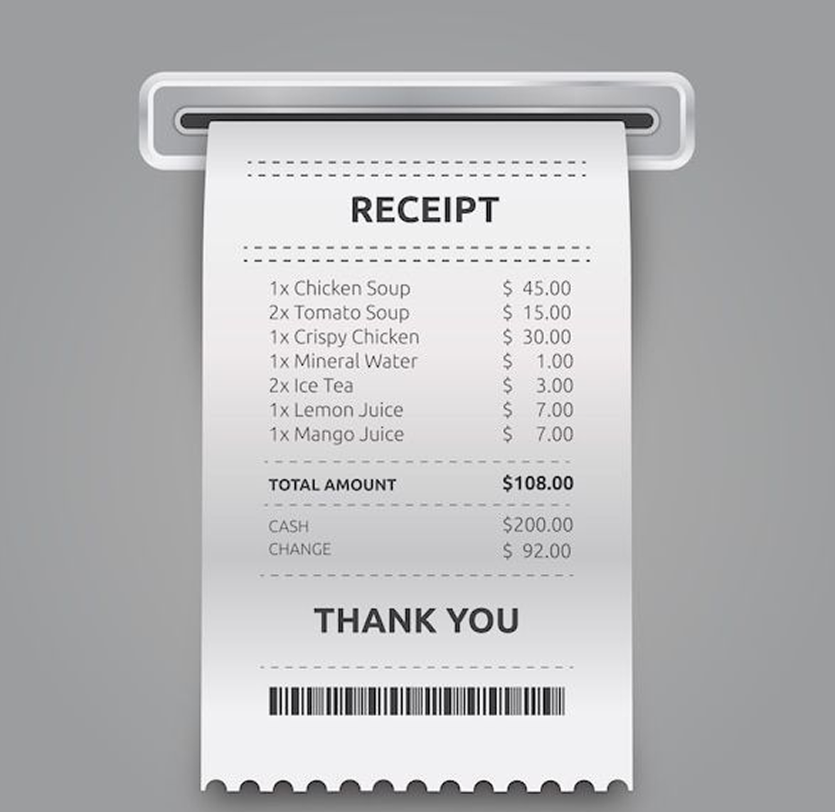
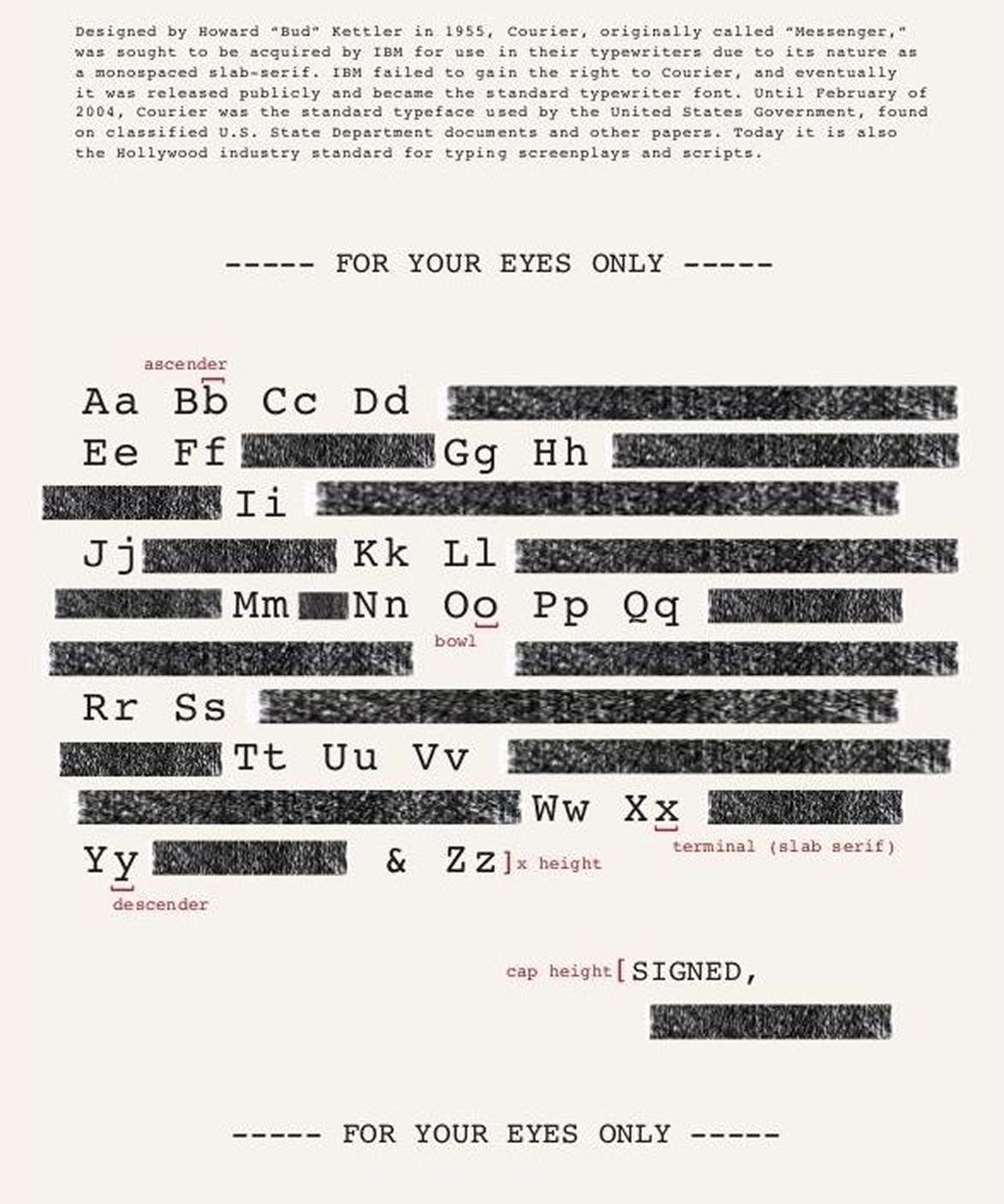
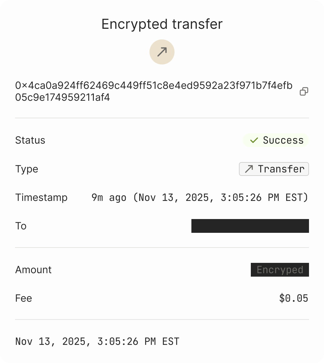
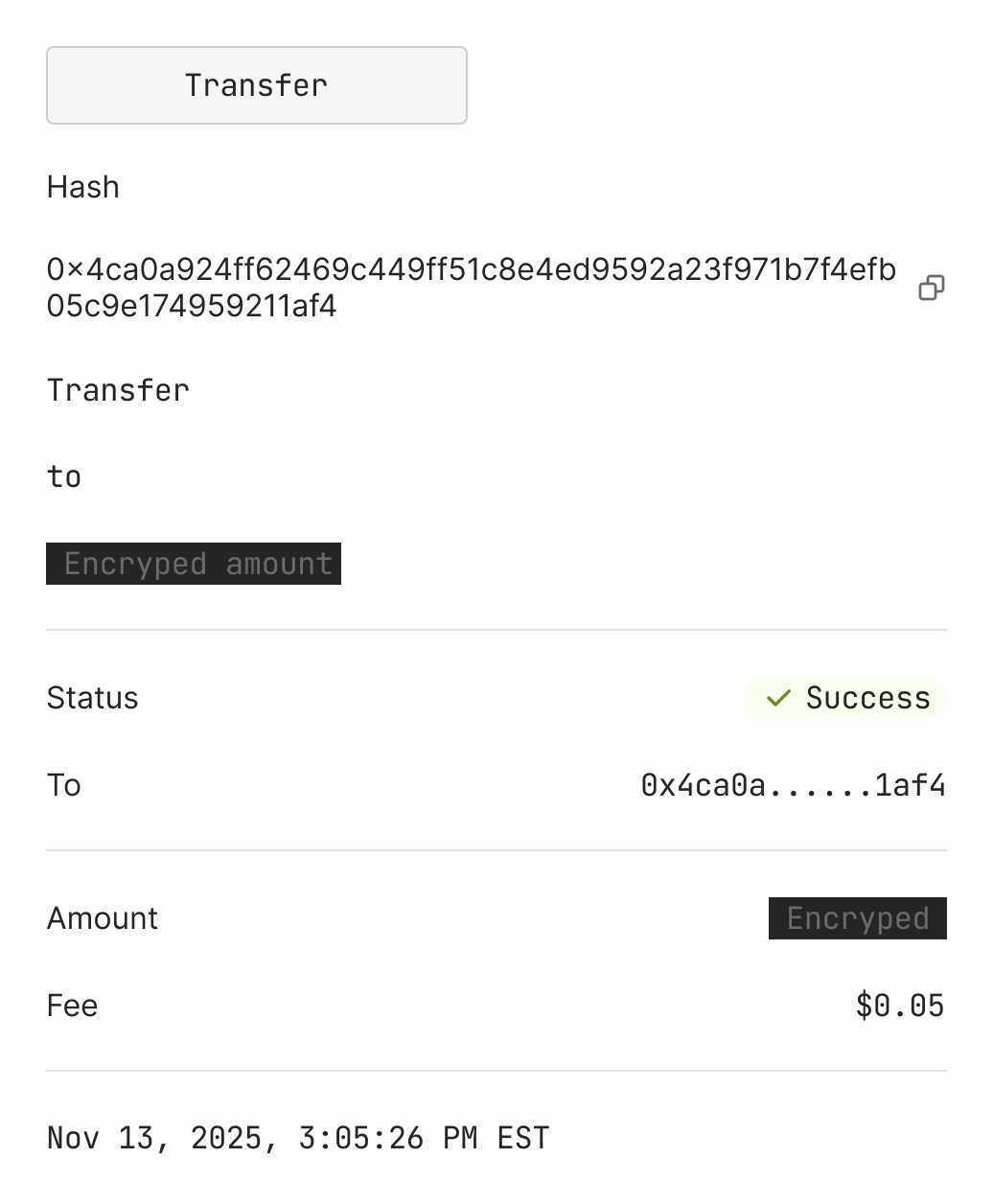
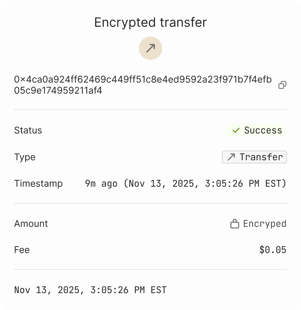
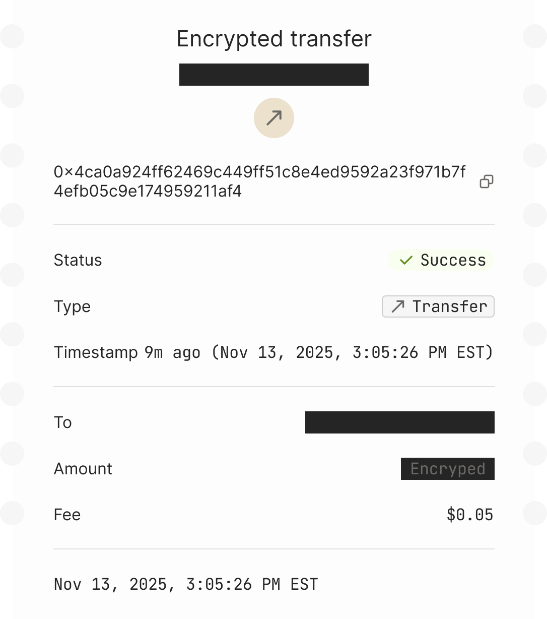
Real-world veiled receipts and dot-matrix carbon copies — the kind banks and government offices used for decades — communicate confidentiality through form, not absence. The data is there, but you can tell at a glance it’s protected. That became the visual language for encrypted fields in the Explorer.
The principles I worked from
- Familiar to web2, legible to web3. (The main one.) Same surface, two readings — a payment user reads it as a normal app; an institutional engineer reads it as a verifiable protocol. Four sub-principles fall out of that:
- Encrypted ≠ missing. The Explorer treats encrypted fields as a deliberate, styled artifact — a differentiator from the competitors, not a redacted blank.
- Privacy as control, not opacity. Advanced Recipient Protection surfaces as a visible user choice with state, not a hidden default.
- Compliance is a feature, not a tax. Auditor key flows live alongside transaction flows, not buried in settings.
- Fees as honesty. Additive fee model — every cost visible, nothing rolled into a spread.
How the work got made
This was the first project where I pushed production code on a regular basis. The workflow shifted by task type:
- Engineering-led prototypes that needed polish. I’d either fix it directly in the codebase, or spin up a focused Figma file to optimize a single module before handing it back.
- Miscellaneous UI craft and motion work. Straight into the code. Polish, micro-interactions, motion — done in place, no handoff round-trip.
- Visual exploration. Figma stayed the best canvas. Once a direction landed, I’d either implement it myself or walk it to engineering knowing exactly what was needed and why.
The throughline: pick the medium that lets the next decision happen fastest. Code for things that already exist and need refinement. Figma for things that don’t exist yet and need shaping. Neither tool is a default — the work decides.
This is what made it realistic for one designer to own brand, product, and marketing site simultaneously. It also changed how engineers and I worked together: when I showed up with a working PR or a prototype already running against the real protocol, the conversation skipped past “is this technically possible” and went straight to “is this the right behavior.”
Impact
The foundation is sized for what’s next — more verticals, more surface apps, the same brand and design system carrying them.